
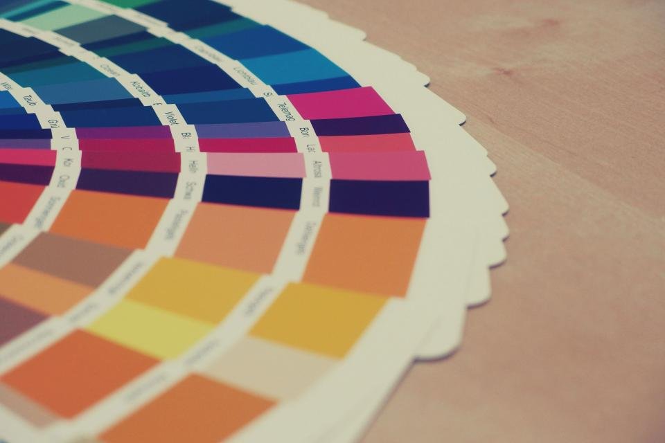
Your brand colors are often the first thing people notice and the easiest thing to remember about your business. The right palette makes your website, logo, vehicles, and marketing instantly recognizable. The wrong one can make a great business look cheap, confusing, or like a competitor.
This guide walks you through how to choose brand colors step by step: what colors tend to communicate, how many brand colors you should have, how to build and test a palette, example palettes for common small businesses, and how to choose fonts that match.
The Short Answer: How to Choose Brand Colors
- Start with your positioning and three brand personality words.
- Look at the colors your competitors use, so you can stand out.
- Choose one primary color that fits your personality and market.
- Add one or two secondary colors and an accent color for buttons.
- Add neutrals for text and backgrounds.
- Test contrast so your text and buttons are easy to read.
- Test the palette in real use, then document the exact color codes.
What Brand Colors Communicate
Colors carry common associations, though meanings vary by culture, industry, and context, and no color guarantees a reaction. Use these associations as a starting point, not a rule:
- Blue: trust, calm, reliability, professionalism. Common in finance, healthcare, technology, and trades.
- Green: growth, health, nature, freshness. Common in landscaping, wellness, eco-friendly, and financial growth businesses.
- Red: energy, urgency, passion, appetite. Common in food, emergency services, and bold brands.
- Orange: friendliness, enthusiasm, affordability, action.
- Yellow: optimism, warmth, attention. Often best as an accent, since it can be hard to read.
- Purple: creativity, luxury, imagination.
- Black: sophistication, power, premium quality.
- Brown and earth tones: reliability, natural materials, craftsmanship.
- Pink: warmth, care, playfulness, or modern boldness depending on the shade.
- White and light neutrals: simplicity, cleanliness, space.
The shade matters as much as the color. A deep navy feels very different from a bright sky blue, and a muted sage green feels different from a neon green.
How Many Brand Colors Should You Have?
Most small businesses need three to five colors in total:
- One primary color: your signature color, used in the logo and key elements.
- One or two secondary colors: support the primary and add variety.
- One accent color: for buttons and calls to action, so they stand out.
- One or two neutrals: a dark color for text and a light color for backgrounds.
A common design guideline is the 60-30-10 rule: roughly 60% of a design in a dominant (often neutral) color, 30% in a secondary color, and 10% in an accent. It keeps designs balanced and makes the accent color draw attention where you want it, usually your “Call Now” or “Get a Quote” button.
More than five brand colors usually leads to inconsistent materials and a business that’s harder to recognize.
Step 1: Start With Your Positioning and Personality
Your colors should express who you are and who you serve. Before looking at a single color, write down:
- Your brand positioning statement: who you serve and why you’re different.
- Three personality words, such as “dependable, friendly, straightforward” or “premium, precise, calm.”
Then ask which colors fit those words. “Premium, precise, calm” points toward deep navy, charcoal, or forest green, not bright orange.
Step 2: Study Your Competitors’ Colors
Search for your service in your area and note the colors of the top five competitors’ logos and websites. If every plumber in town uses blue and red, a distinctive color can help you stand out in search results, on yard signs, and on the road. Standing out matters more than following the category, as long as the color still fits your personality.
Step 3: Choose Your Primary Color
Pick one color that fits your personality, stands apart from competitors, and works on both light and dark backgrounds. Then choose the exact shade. Try a few shades side by side on a mock business card or website header before deciding.
Step 4: Add Secondary and Accent Colors
Choose one or two secondary colors that work well with your primary. Simple approaches that usually work:
- Analogous: colors next to each other on the color wheel (for example, blue and teal) for a calm, harmonious look.
- Complementary: colors opposite each other (for example, navy and orange) for energy and contrast, often used for an accent.
- Monochromatic: lighter and darker shades of your primary color, for a clean, simple palette.
Your accent color should contrast strongly with your primary and backgrounds so buttons and important links stand out.
Step 5: Add Neutrals
Neutrals do most of the work on your website and documents. Choose:
- A dark color for text: near-black, charcoal, or a very dark version of your primary.
- A light color for backgrounds: white, off-white, or a very light gray.
- Optionally, a mid-gray for borders and secondary text.
Step 6: Test Contrast and Accessibility
A color palette is only useful if people can read it. Text and buttons need enough contrast against their backgrounds, especially on phones outdoors.
The Web Content Accessibility Guidelines (WCAG) recommend a contrast ratio of at least 4.5:1 for normal text and 3:1 for large text at the AA level. Free tools like the WebAIM Contrast Checker tell you the ratio for any two colors.
Common problems to avoid:
- Light gray text on white backgrounds.
- White text on yellow, light green, or light blue buttons.
- Using color alone to show important information.
Our guide to website accessibility explains why this matters for customers and for legal risk.
Step 7: Test in Real Use, Then Document It
Before you commit, put your palette on:
- Your logo, in full color and in a one-color version.
- A website header and a call-to-action button.
- A business card and an invoice.
- A vehicle, sign, or shirt, if you use them.
- A social media post.
If it looks good everywhere and is easy to read, record each color’s codes:
- HEX for websites (for example, #1B4D7A).
- RGB for screens and digital design.
- CMYK for printing.
- Pantone if you print signs, shirts, or promotional items and need exact matching.
Add these to your brand style guide. Here’s how to build a brand identity and style guide.
Example Brand Color Palettes for Small Businesses
These example palettes show how the steps come together. Adjust the shades to fit your own business.
- Plumbing or HVAC (trustworthy, fast): deep navy #1B3A5C, bright orange accent #F28C28, light gray #F2F4F6, charcoal text #222831.
- Accounting or financial services (calm, credible): dark teal #0F4C5C, soft sage #A3B9A5, warm gold accent #C9A227, off-white #FAFAF7, near-black text #1E1E1E.
- Landscaping (natural, dependable): forest green #2E5E3A, earth brown #7A5C3E, fresh lime accent #9BC53D, cream #F7F4EC, dark text #23271F.
- Bakery or cafe (warm, inviting): warm cream #FFF4E6, berry pink #C2416B, cocoa brown #5B3A29, golden accent #E9A93B.
- Law firm (premium, steady): charcoal #2B2D33, deep burgundy #6B1E2E, muted gold accent #B89B5E, white #FFFFFF.
- Hair salon or spa (modern, calm): soft blush #F3D6CF, deep plum #4A2545, rose gold accent #B76E79, light neutral #FBF8F6.
How to Choose Brand Fonts That Match Your Colors
Colors and fonts work together. Keep it to two fonts:
- Heading font: carries personality. A strong sans-serif feels modern and clear; a serif feels traditional and established; a rounded sans-serif feels friendly.
- Body font: clear and easy to read at small sizes on a phone.
Choose fonts that are available for both web and print (free Google Fonts work well), and decide on standard sizes and weights for headings, body text, and buttons.
Using Brand Colors on Your Website
- Use your accent color mainly for calls to action, so buttons stand out.
- Keep most backgrounds light and neutral so content is easy to read.
- Use your primary color for headers, icons, and highlights.
- Keep links a consistent color that’s clearly different from body text.
- Check every color combination on a phone, not just a desktop monitor.
Strong colors help, but clear words convert. See how to write homepage copy that turns visitors into customers.
Common Brand Color Mistakes
- Choosing a color only because you personally like it.
- Copying a competitor’s colors so customers confuse you with them.
- Using too many colors, so nothing looks consistent.
- Low-contrast text and buttons that are hard to read.
- Not recording exact color codes, so every printer and designer uses a slightly different shade.
- Changing colors often, which undoes the recognition you’ve built.
Frequently Asked Questions
How do I choose colors for my brand?
Start with your positioning and personality, check what competitors use, choose a primary color that fits and stands out, add secondary and accent colors plus neutrals, test contrast, and try the palette on real materials before committing.
How many brand colors should I have?
Three to five in total: a primary color, one or two secondary colors, an accent for buttons, and neutrals for text and backgrounds.
What is the best color for a business logo?
There’s no single best color. The best choice fits your personality, stands out from competitors, and works well in one color, on light and dark backgrounds, and at small sizes.
Can I change my brand colors later?
Yes, but plan it as part of a brand refresh so everything changes together. Changing colors one item at a time creates inconsistency. Read rebranding a small business before making big changes.
Do brand colors affect SEO?
Not directly. Colors affect how easy your site is to read and use, how much people trust it, and whether they click your buttons, which all influence how many visitors become customers.
Want Help Creating Your Brand Colors?
CDD Services designs logos, color palettes, and full brand identity packages for small businesses, and carries them through to your website. Get a free website review and we’ll show you how your brand looks to new customers.